February 2022 | Paragraph and List Content Blocks, Text Management Improvements

Summary
As previously announced, we have released new text management features and added Paragraph and List content blocks to improve the text editing experience for all Beefree SDK builders.
These content blocks will replace the Text content block. While this block is still available, it will not include the new features described here or any future improvements.
We are replacing the original text block for two main reasons:
-
To create a better user experience by providing enhanced styling controls for specific types of content, as described below.
-
To provide more ways to leverage Advanced Permissions and Content Defaults for more precise control over text editing options on a per-user basis.
This release includes several improvements to the text management user experience. Among other things, we have made the following features available for the new content blocks alongside the existing Title and Button content blocks.
-
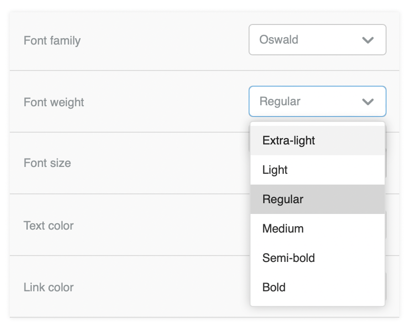
Font-weight control. Users may now select multiple font-weight from the same font family within a single design.
-
Text toolbar enhancements. We now include buttons to insert non-breaking spaces, clear formatting, and insert special characters.
A Smoother Text Management Experience
In January 2021, we added the Title content block to provide a “styles hierarchy” that allows the host application to define default styles for headings. This content block renders with better accessibility by generating semantic elements for titles. It also provides a more straightforward and friendlier UI.
We are now adopting the same approach to improve the overall text editing experience in all Beefree SDK Builders.
Text Content Block Consistency
Our new text management strategy relies upon a separation between formatting options to create specialized content blocks that can still be globally configured to conform to branding guidelines. To achieve this, we have limited the text toolbar to character formatting and provided content formatting properties for the Title, Paragraph, and List blocks in the sidebar. This strategy creates a more streamlined user experience when editing the same text snippet several times.
When you select a title, the text toolbar above it displays the character formatting, and the sidebar provides the heading formatting options.
Character formatting is available with a newly streamlined text toolbar whenever a snippet of text is selected. This toolbar also handles actions that depend on specific positions within a snippet, such as hyperlinking, special character insertion, and custom syntax.
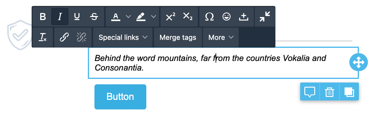
Text toolbar for the Paragraph content block
Content formatting, like font family, font size, or paragraph direction, is handled by content block properties that apply to the entire block. These properties are located in the sidebar to eliminate the need for manual selection when updating text. This small change improves the general user experience and speeds up recurrent actions.
New Formatting Options
The separation between content formatting and character formatting allows the builder to provide a broader set of options while minimizing formatting risk. The selected property is specific to the content block, avoiding nested styles that may overwrite in the browser and cause formatting issues when making changes.
Advanced Use Case Support
With more control over general text styles, tailoring the editing experience for your users is a breeze. You can use Advanced Permissions and Content Defaults to provide a rock-solid and on-brand editing experience.
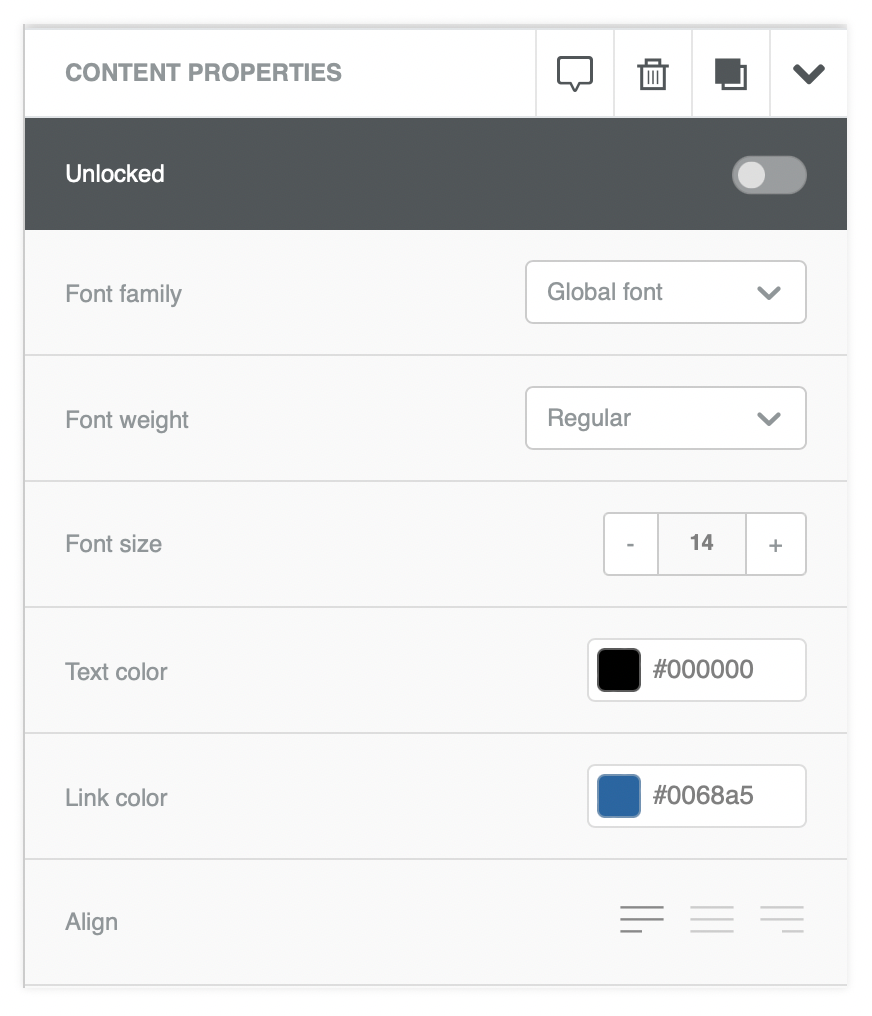
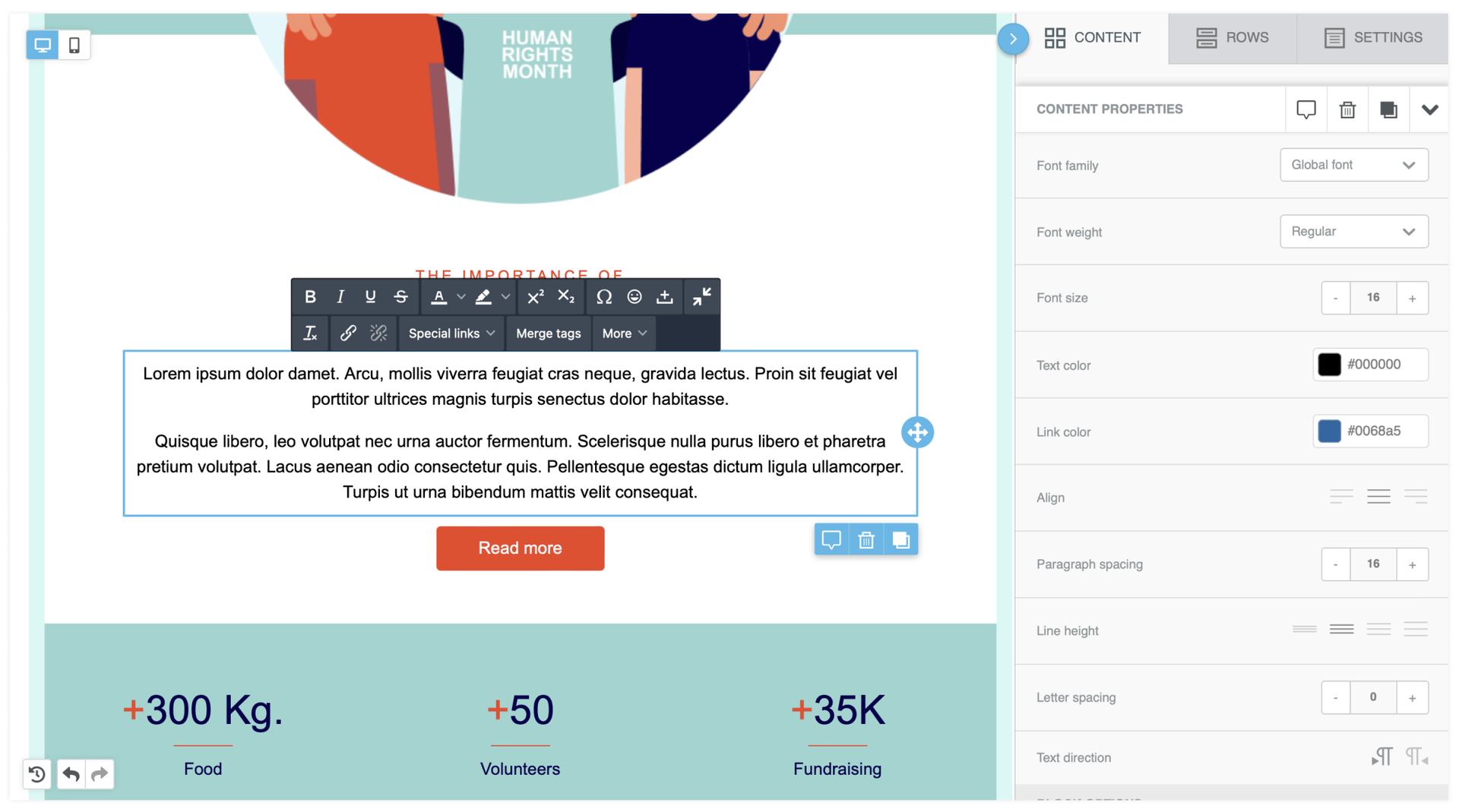
For example, you may allow someone to define the type of bullet list style to be used and enforce it in the visual builder by setting a default style and preventing edits on that property. You could do the same with a heading style by restricting editing access to the Title block properties, as shown in the screenshot below.
Title block with formatting restrictions to maintain defined brand guidelines
Description of Changes
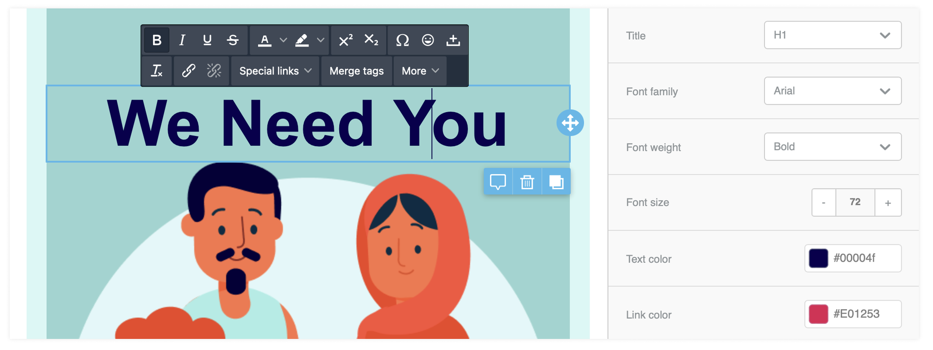
Paragraph Content Block
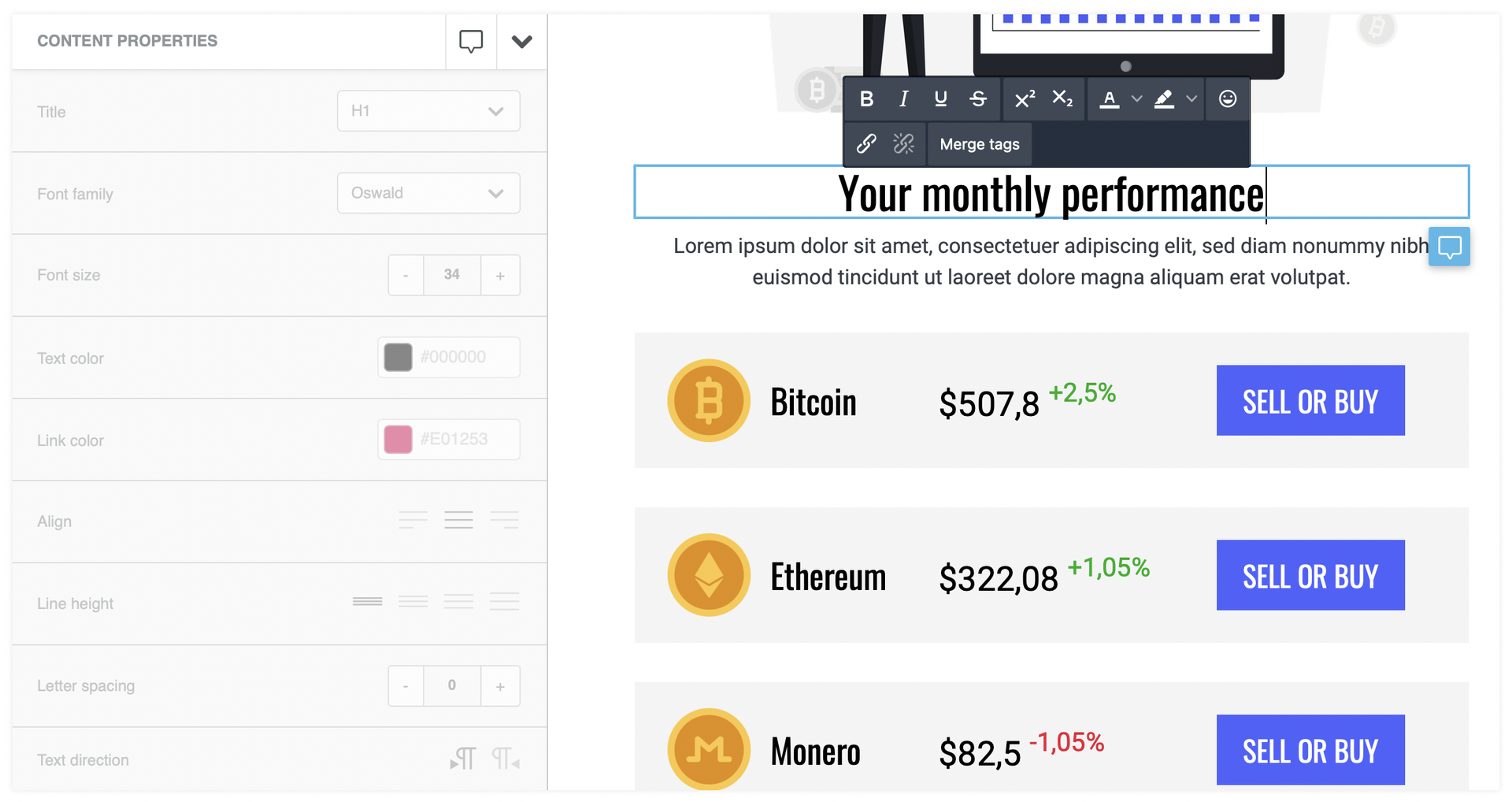
The Paragraph content block is the new cornerstone of text editing in Beefree SDK builders. It supports any number of paragraphs of any length that share the same content formatting, such as font family, font size, and font weight.
This new content block delivers a better experience than the original Text block, resolving formatting issues such as lost styling during text selection.
Paragraph content block with properties displayed
Available Options
| Content formatting options (Sidebar) | Character formatting options (Text Toolbar) |
|
Font family |
Bold |
|
Font weight |
Cursive |
|
Font size |
Underline |
|
Text color |
Strikethrough |
|
Link color |
Text color |
|
Align |
Background color |
|
Paragraph spacing |
Superscript |
|
Line height |
Subscript |
|
Letter spacing |
Special characters |
|
Text direction |
Emoticons |
|
|
Non-breaking space |
|
|
Clear formatting |
|
|
Insert/edit link |
|
|
Remove link |
|
|
Special links (optional) |
|
|
Merge tags (optional) |
|
|
Content dialog triggers (optional) |
The Paragraph content block is also encoded with parameters to manage copy-paste operations better. Specifically, bolded, italicized, and hyperlinked source styling is maintained. The destination content block properties determine the font family, size, and weight.
List Content Block
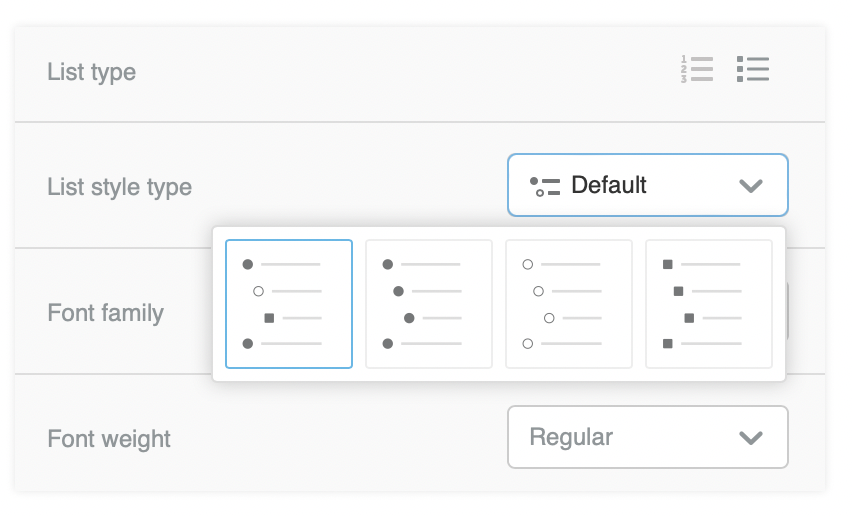
The List content block provides specialized support for numbered and bulleted lists. It includes more unique formatting properties and removes irrelevant ones, providing a better user experience overall.
This new content block offers the same styling options, font management, and copy-paste operations formatting improvements as the paragraph content block. We created a separate content block for list elements to provide more granular control over list formatting that may have different design requirements than general text.
Specifically, we have added properties to manage the list type, spacing, and indentation. There is also a “start from” option for numbered lists to provide additional flexibility.
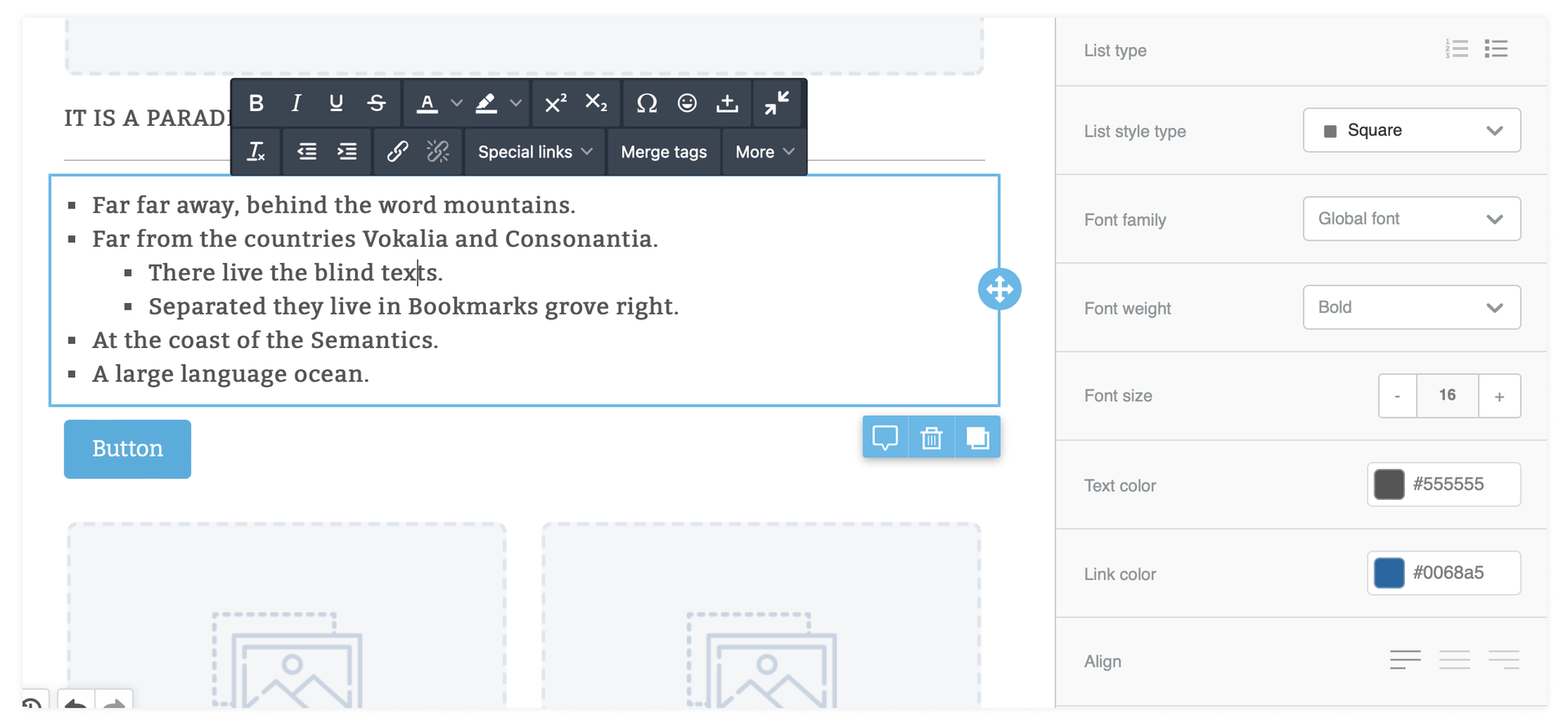
List content block with properties
Available Options
| Content formatting options (Sidebar) | Character formatting options (Text Toolbar) |
|
List type |
Bold |
|
List style type |
Cursive |
|
Start list from (only for numbered list) |
Underline |
|
Font family |
Strikethrough |
|
Font weight |
Text color |
|
Text color |
Background color |
|
Link color |
Superscript |
|
Align |
Subscript |
|
List items spacing |
Special characters |
|
List items indent |
Emoticons |
|
Line height |
Non-breaking space |
|
Line height |
Clear formatting |
|
Text direction |
Insert/edit link |
|
|
Remove link |
|
|
Special links (optional) |
|
|
Merge tags (optional) |
|
|
Content dialog triggers (optional) |
Implementation
Some changes to the host application configuration are needed to make full use of these features as detailed below:
-
Configure Content Options
-
Specify font-weight settings in Font Management (optional)
-
Configure Advanced Permissions (optional)
-
Configure Content Defaults (optional)
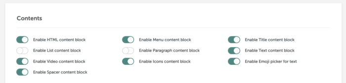
Once the host application is ready, you may use the configuration options available in the Developer Portal to toggle on the content blocks you wish to enable.
The Original Text Content Block
We recommend disabling the original Text content block when enabling the new features.
That said, the builders are still fully backward compatible so that any templates that contain original text content blocks will still function. If you have disabled the original Text content block in the developer portal, you can still edit any existing blocks. When users load a design into the builder, they can select any original Text block on the stage, and the Content sidebar will still display normally.
Comments
0 comments
Please sign in to leave a comment.