Creating Mobile Responsive Designs

Creating Responsive Designs
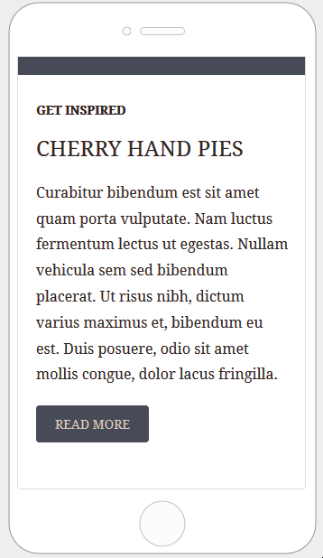
Quite often, content in an email is organized in multiple columns. When viewed on a mobile device, those columns can become too narrow and lead to a sub-optimal reading experience. To guarantee a better experience while reading emails on mobile devices, the builder generates HTML code that makes columns stack vertically. Content is thus reorganized to eliminate zooming and allow for easy finger scrolling.
Sometimes you may want to make changes to the default mobile optimization settings that the builder uses. There are plenty of different features you can use to do this. Let’s go over the different options that can impact the mobile version of your design.
Stacking Options
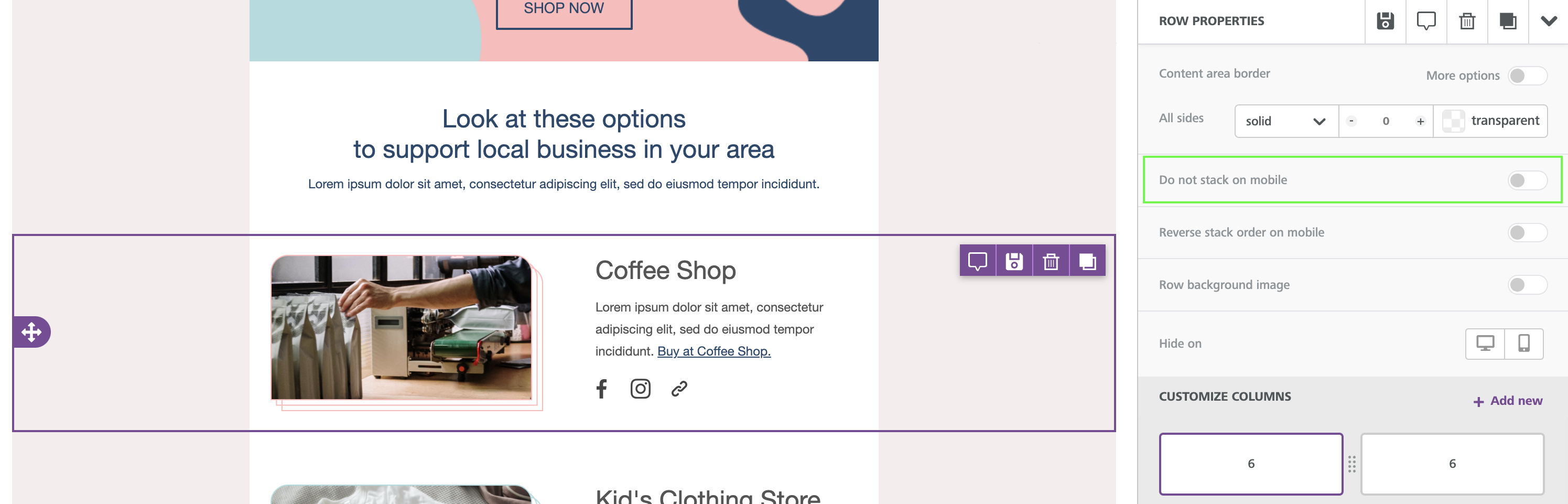
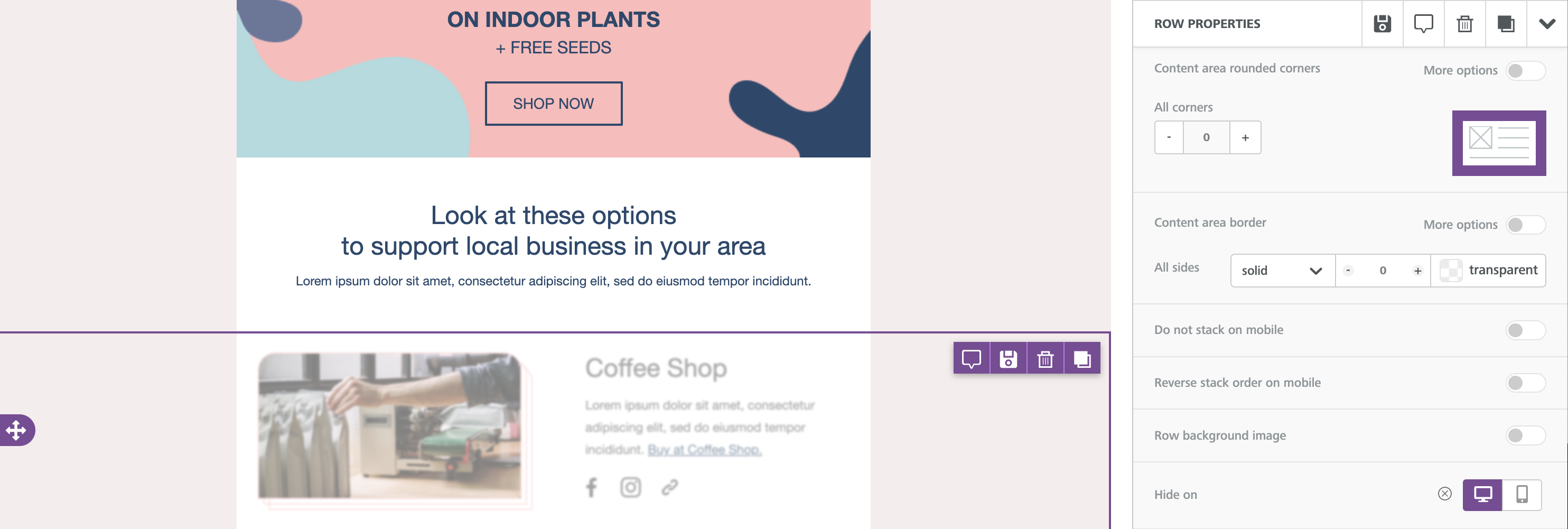
Do not stack on mobile
The Do not stack on mobile row setting allows you to override the default stacking behavior.
The option is available in the right panel as a row property, toggled off by default.
Email design best practices suggest a careful use of this display setting. A user-friendly vertical layout on mobile makes sense in most cases. As always, it is up to you and your creativity when and how to use this option.
Reverse stack on mobile
In some cases, the columns stacked on mobile can work better in a reversed order.
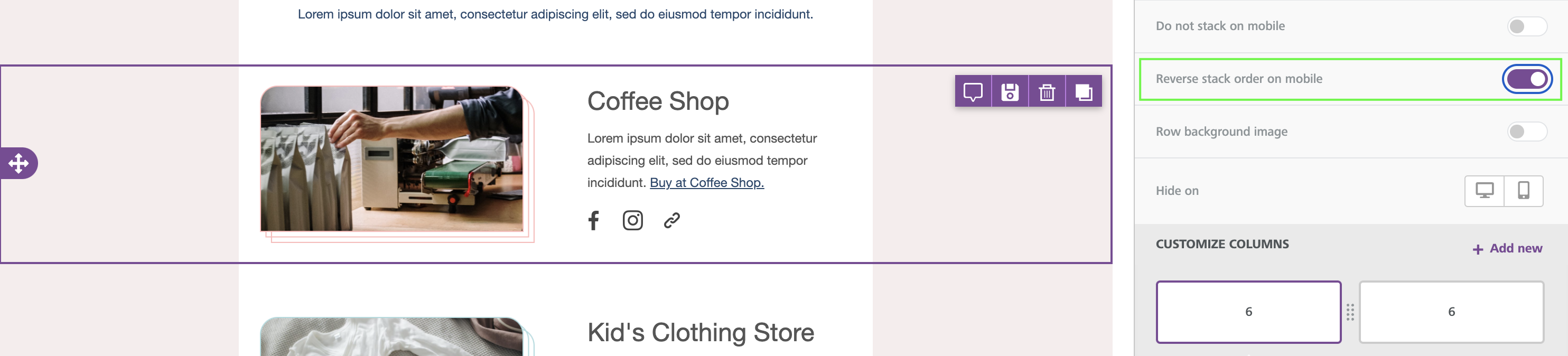
Here is an example:
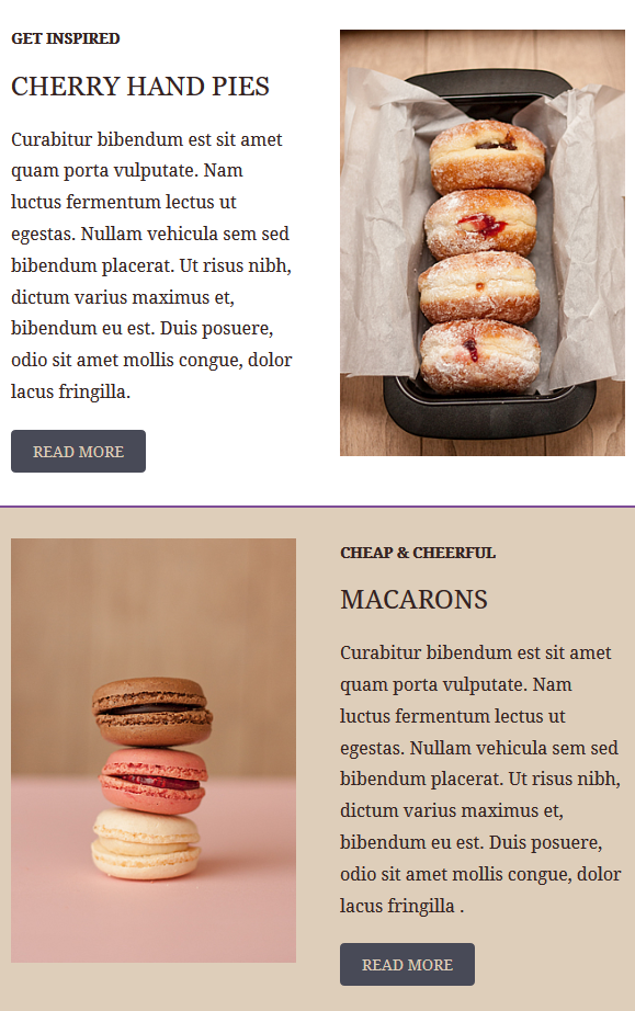
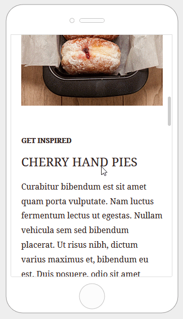
The same template also has a section where images are aligned on the right.
This is how these two sections render on mobile by default:
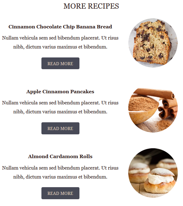
Here is how the email layout renders when columns are stacked in reverse order:
Hiding Content
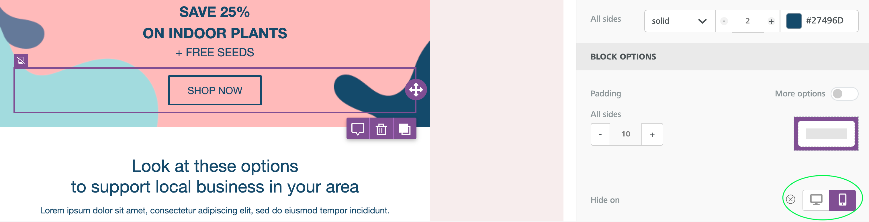
All content blocks in the builder include a Hide on setting in the properties panel. To use it, scroll down until you see the Block options section.
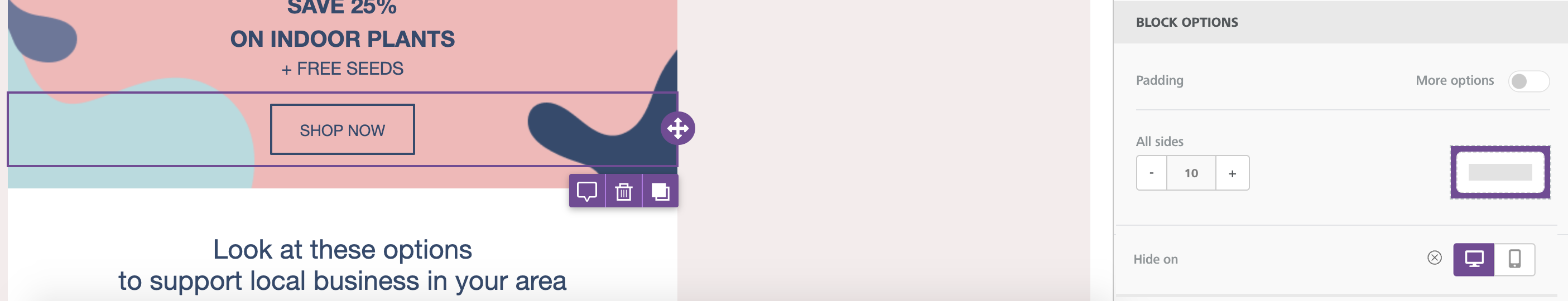
You can check the result by going into the Preview and selecting the Mobile view. You will see that the content blocks for which Hide on has been turned on will not be visible.

Hiding Rows
If you need to hide a larger portion of your design, you might consider hiding an entire row instead. The workflow is almost identical to the one you use to hide individual content blocks.
To start, you'll want to make sure that you select the row you want to hide. You can find this option at the bottom of the Row Properties section of the sidebar. This section is directly above the Column Properties section.
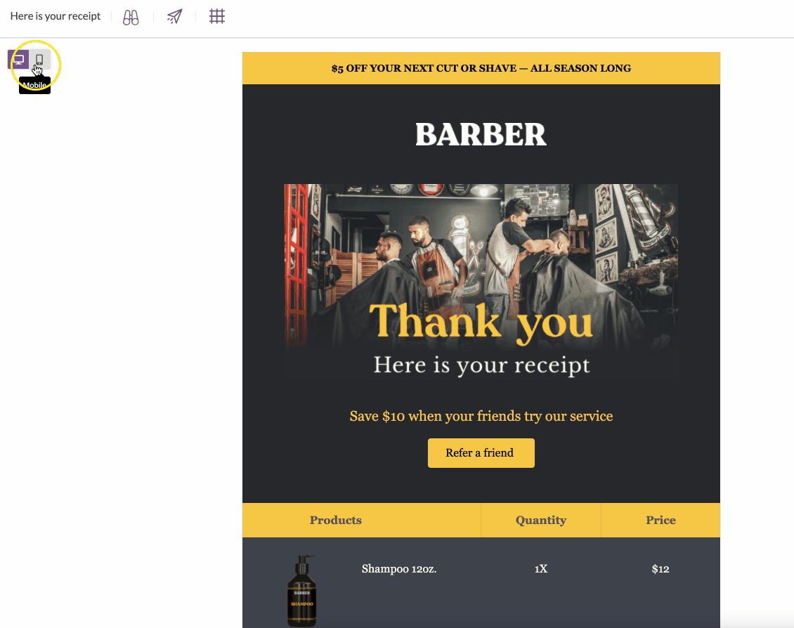
Mobile design mode
When working inside of the builder, you'll see a couple of icons in the upper left-hand corner of the builder stage.

These icons function as a toggle that allows you to switch between a desktop and mobile view. The desktop view will allow you to work with the same builder you're already familiar with. If you switch to the mobile view, the content area will reduce to 320px.
When you have the mobile view enabled, you can continue to design your message using all the same features and options. Keep in mind that the mobile design mode uses a grey backdrop that is not part of your message design.
Visibility Options
If you're using "hide on mobile/desktop" on any content blocks within your message, you'll see another icon show up to the right of the design mode toggle. This icon determines whether or not you want content blocks that are hidden from your selected design mode to populate on the builder stage.
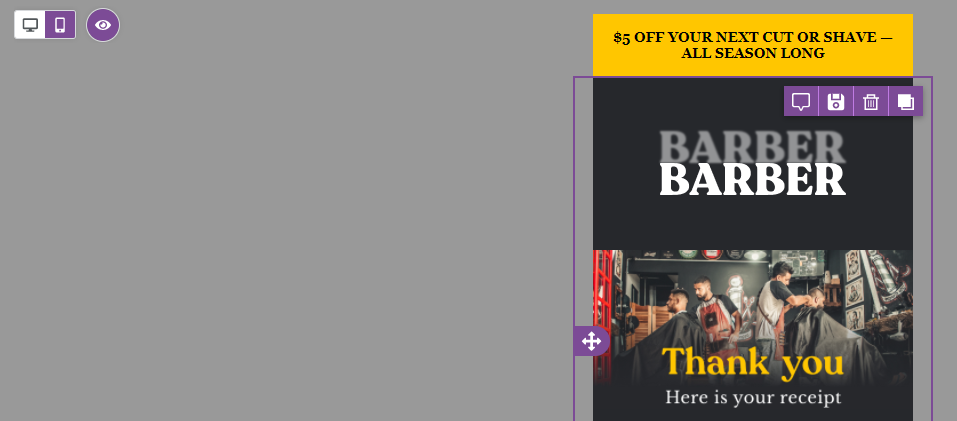
In the screenshot below, we see someone working in mobile design mode with the toggle turned on.
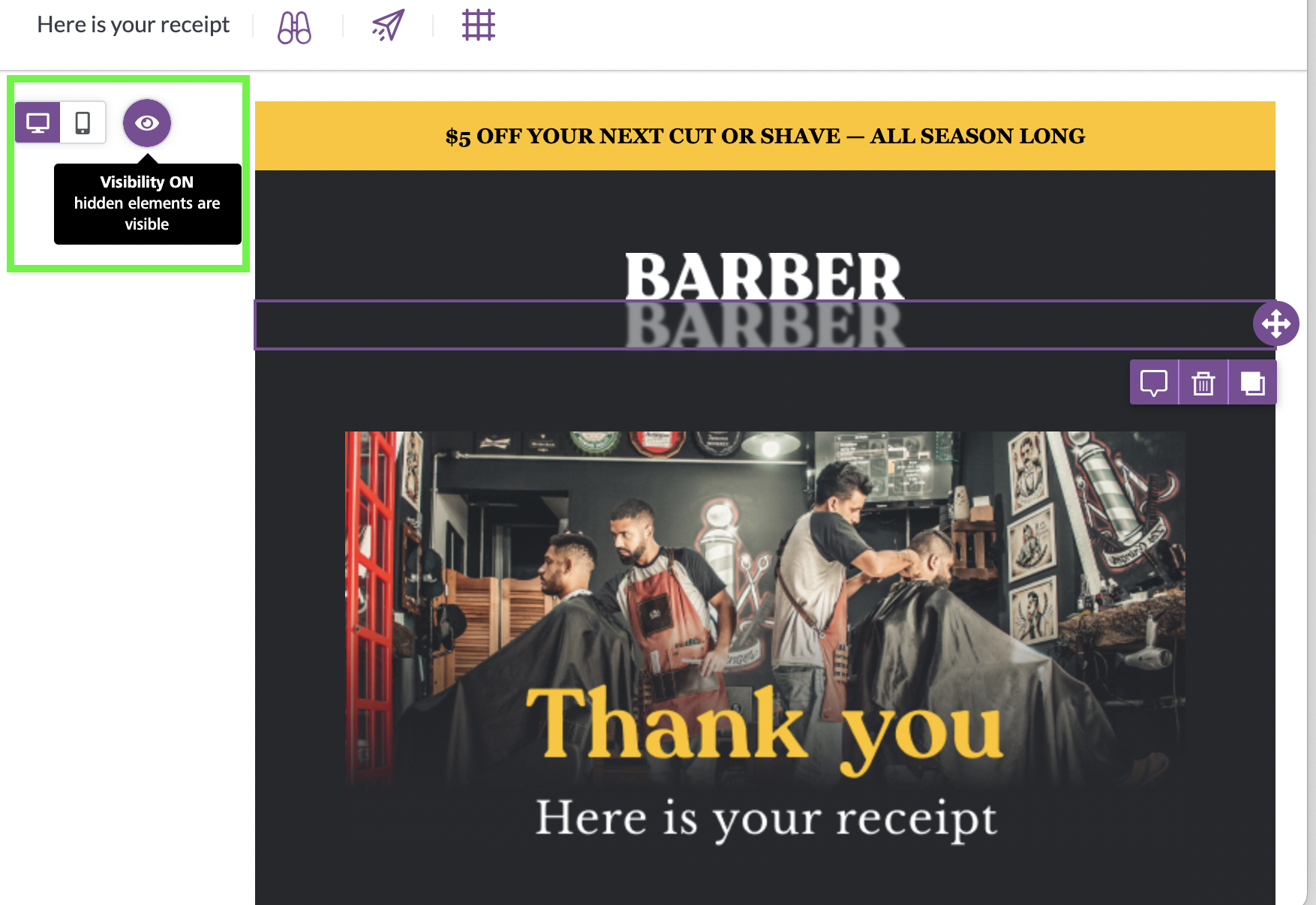
With visibility turned on, the designer can still see content that is hidden from mobile devices on the builder stage. If the designer wants the design mode to function more like a preview, then this option can be turned off.
Hidden Content
Have you noticed that a certain content block appears translucent or out of focus? You're probably looking at a content block that is hidden from the type of device that your chosen design mode is reflecting.
Say, for example, you've inserted two versions of your company logo into a design. One logo has been optimized for mobile, while the other has been optimized for desktop. As a result, you have hidden these content blocks from the respective devices.
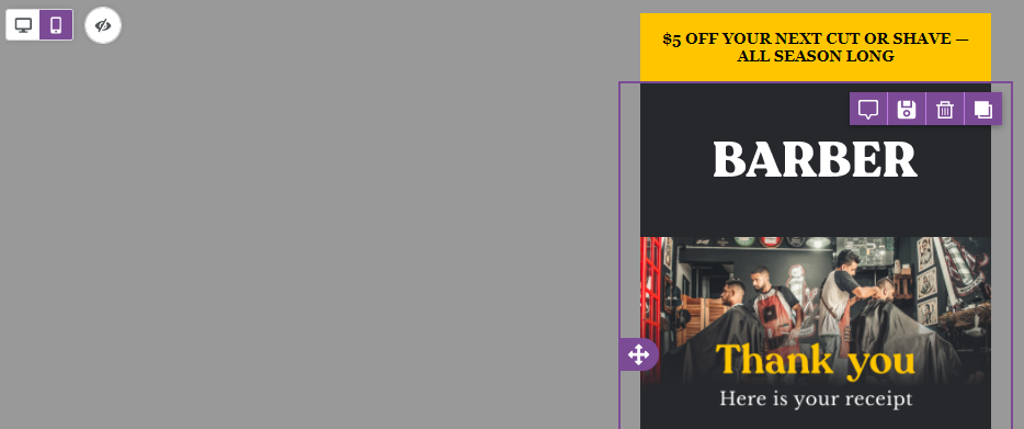
When working with the builder in desktop design mode, any content that is hidden from that view will appear translucent.
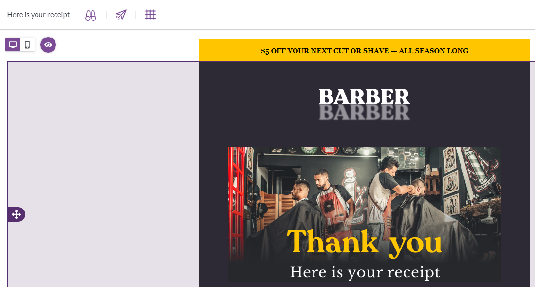
In the example above, the logo on top is the one that is hidden from mobile. It appears as expected in this design mode as a result. However, the logo below is hidden from desktop - so the opacity of the content block has been removed so that you can easily identify which one is which, without needing to check the content settings.
Similarly, you'll see the opposite behavior in the same example in mobile design mode.
Now the opacity has been reduced on the desktop-optimized content.
Keep in mind that, when hidden content is selected in the design mode that it is hidden from, you can only make changes to it in the builder sidebar. If the hidden content is text-based, for example, you'll need to switch to the design mode where it is always visible to update the content. However, you can alter the settings for the content block from any view.
Note that this behavior only occurs when visibility mode is enabled. If you'd prefer to see only the version of the content that is appropriate for your design mode, you can turn off visibility mode.
Mobile styling
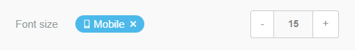
You may select certain content properties to apply only to mobile. If you click on a content property's "Mobile" icon while in Mobile Design Mode, the changes you make will only apply to the mobile output.
This feature is available for the following content block properties. Please note that not all content blocks have the same properties available.
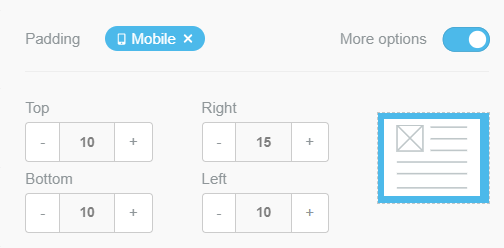
Padding
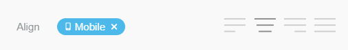
Alignment
Font size
Mobile Design Mode limitations
When in mobile design mode, the builder retains most of its functionalities, with a few exceptions:
- You cannot change the content area width; it can only be changed in the desktop view.
- You can add and delete columns in a row, but you cannot resize them.
Comments
0 comments
Please sign in to leave a comment.